
Mastering web development
Build a High-Performance WordPress Website That Wins Clients
Welcome! If you’re looking for someone to craft a clean, fast, and conversion-focused WordPress website, you’re in the right place. I bring years of hands-on WordPress experience and nearly two decades in IT and the internet, blending design, development, and SEO strategy to deliver sites that look great and rank.
What you get
About SEO
In the mid-1990s, when the internet was still a kind of “wild west” full of messy web pages, the first search engines like Yahoo! and AltaVista started to appear. Website owners quickly realized that if they wanted visitors, they needed to show up in the top results; that’s when they began to experiment with titles, descriptions, and keywords so that search engines could find them more easily. Over time, some specialists started to dedicate their entire careers to this work. One of the most commonly mentioned names is Bruce Clay, considered by many as one of the “fathers of SEO”: in 1996 he founded his own company and began teaching methods to improve visibility in search engines.
By around 1997, the term “Search Engine Optimization,” or SEO, started to become popular to describe these optimization techniques, just before Google was born in 1998 and changed the game with its link algorithm (PageRank), making content quality and backlinks from other sites more and more important. Since then, SEO has evolved with every algorithm update, but the central idea remains the same: create useful, well-structured content to attract organic traffic and, among other things, monetize that traffic with advertising such as Google’s.
In a few words, SEO on the web is the set of techniques used to improve a site’s visibility in the organic results of search engines, increasing both the quality and quantity of its visits, which happens gradually and not all at once. Improving your ranking could take between one and six months after the site is launched, provided it adheres to these guidelines.
Responsive design
When the web first started to become popular in the late 1990s and early 2000s, most websites were designed with only one thing in mind: a desktop monitor, usually 800×600 or 1024×768 pixels. Pages had fixed widths, rigid columns and layouts that looked more like printed brochures than flexible interfaces. In that world, nobody imagined that one day we’d be browsing more from our pockets than from our desks.
When smartphones and tablets arrived, everything changed. At first, most sites looked tiny on small screens: you had to pinch to zoom, scroll in every direction and fight with the interface just to read a paragraph. As a quick fix, many companies started creating two separate sites: one for desktop (www) and another for mobile (m.website.com). It worked, but it doubled the work: two designs, two codebases, two places to update and maintain.
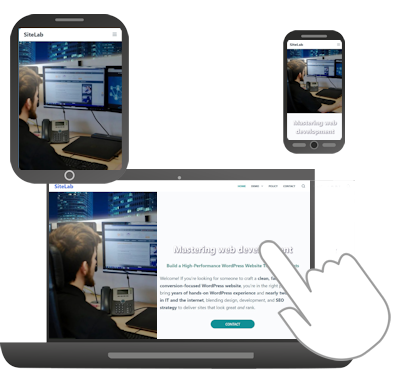
Around 2010, the web community began to push a different idea: instead of building a new site for every type of device, why not build a single site that could adapt? That’s when the concept of responsive web design became popular, based on three main pillars: fluid grids, flexible images and CSS media queries to change the layout depending on screen width. With this approach, the same content could rearrange itself intelligently to look good on a phone, a tablet or a large monitor. Over time, responsive design became the standard. Today, almost any serious project is built with approaches like mobile first, where you design for small screens first and then scale up to larger sizes, ensuring accessibility, speed and a consistent experience across devices.
In simple terms, responsive design is the practice of creating websites that automatically adapt to the size and characteristics of each screen, rearranging content, menus and images so users can always browse comfortably, no matter what device they’re using.